How Can We Help?
When using the Contact Form 7 plugin, the fields will each be on their own row filling up space. If you wish to put multiple fields in one row, you can do this by adding the proper HTML markup when creating the form. Please see below.
<p>Your Name (required)
    [ text* your-name ] </p>
<p>Your Message
    [ textarea your-message ] </p>
<p>[ submit "Send" ]</p>
A form with one field per row will look like this:
A form with multiple fields in one row will look like this. For example, this uses 3 column sections, one field per column:
<div class="ok-row">
<div class="ok-md-12 ok-xsd-12">
  <p class="field">
[ text* your-name placeholder "Name*"]
</p>
</div>
<div class="ok-md-12 ok-xsd-12">
  <p>[ email* your-email placeholder "Email*"]</p>
</div>
<div class="ok-md-12 ok-xsd-12">
  <p>[ text your-subject placeholder "Subject"]</p>
</div>
</div>
  <p>[ textarea your-message placeholder "Message*"]</p>
<div class="text-center">[ submit class:button-block "SEND"]</div>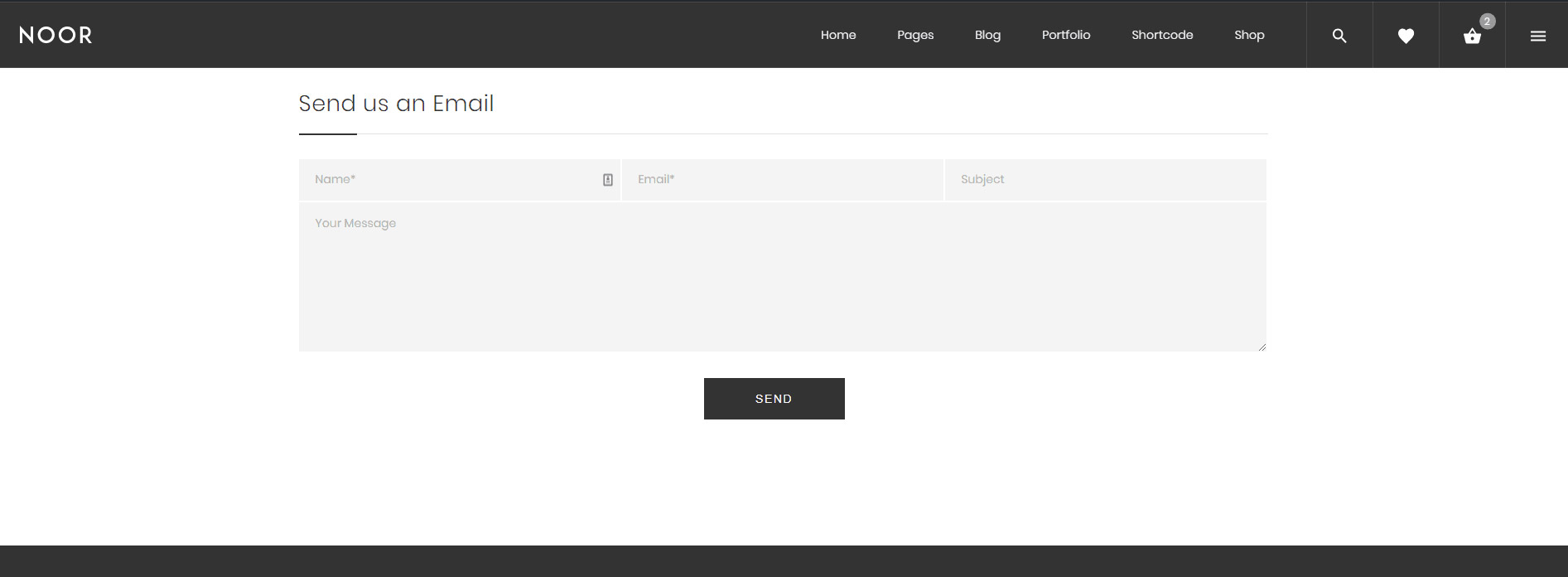
Add Contact Form Into Your Page
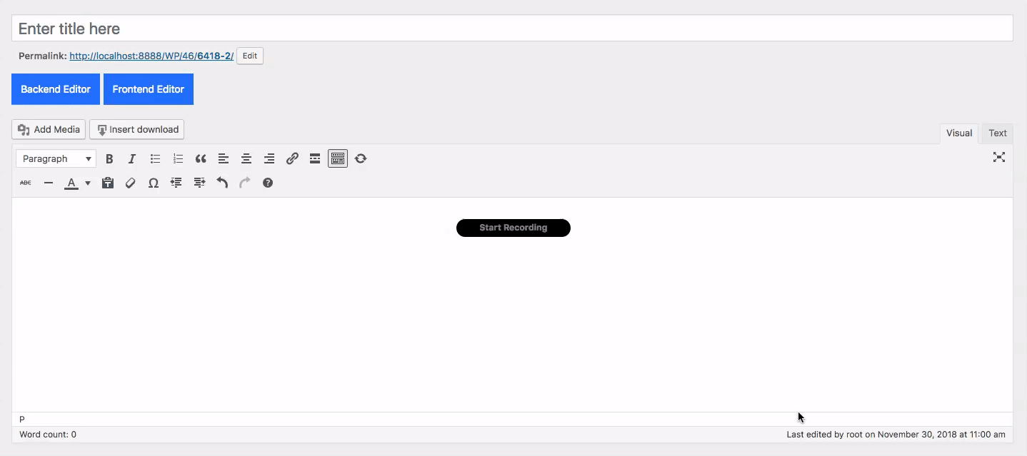
1- Make sure that you have clicked Backend Editor button on the WPBakery Page Builder (formerly Visual Composer) area.
2- Click on the Add Element button to continue.
3- Then when the Add Elements area appear just search for Contact Form 7 ( PixelDima ).
4- Contact Form Settings popup will appear and the options to choose are those:
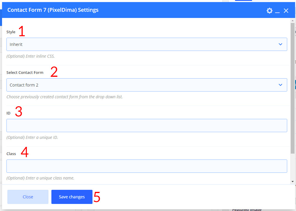
- The Value can be one of the lists: inherit or Material Design
- Chooses your contact form name that you previously created.
- If you wish to style a particular content element differently, then use this field to add an ID name and then refer to it in your Custom CSS area. This field appears on every WPBakery Page Builder element.
- If you wish to style a particular content element differently, then use this field to add a class name and then refer to it in your Custom CSS area. This field appears on every WPBakery Page Builder element.
- Click Save to save your changes and close the popup.
Column Size Classes
- ok-md-12 == 12 clumns
- ok-md-11 == 11 clumns
- ok-md-10 == 10 clumns
- ok-md-9 == 9 clumns
- ok-md-8 == 8 clumns
- ok-md-7 == 7 clumns
- ok-md-6 == 6 clumns
- ok-md-5== 5 clumns
- ok-md-4== 4 clumns
- ok-md-3== 3 clumns
- ok-md-2 == 2 clumns
- ok-md-1 == 1 clumns
Grid Classes
The Noor grid system has five classes:
xsd(for phones – screens less than 480px wide)sd(for tablets – screens equal to or greater than 679px wide)md(for small laptops – screens equal to or greater than 989px wide)lg(for laptops and desktops – screens equal to or greater than 1140px wide)xlg(for laptops and desktops – screens equal to or greater than 1600px wide)